- 각종 그래프 그리기
1. 선 그래프 (Line plot) 그리기
1.1 선 그래프(꺽은선 그래프)
- 점과 점을 선으로 연결한 그래프
- 시간의 흐름에 따른 변화를 표현할 때 많이 사용한다. (시계열)
plot([x], y)- 1번인수 : x값(생략가능), 2번인수 y값
- 인수가 하나인 경우 y 축의 값으로 설정되고 X값은 (0 ~ len(y)-1) 범위로 지정된다.
- x,y 의 인수는 리스트 형태의 객체들을 넣는다.
- 리스트
- 튜플
- numpy 배열 (ndarray)
- 판다스 Series
- x와 y의 size는 같아야 한다.
- 하나의 axes(subplot)에 여러 개의 선 그리기
- 같은 axes에 plot()를 여러번 실행한다.
import pandas as pd
import numpy as np
import matplotlib.pyplot as plt
1.2 선 스타일
- https://matplotlib.org/3.0.3/gallery/lines_bars_and_markers/line_styles_reference.html
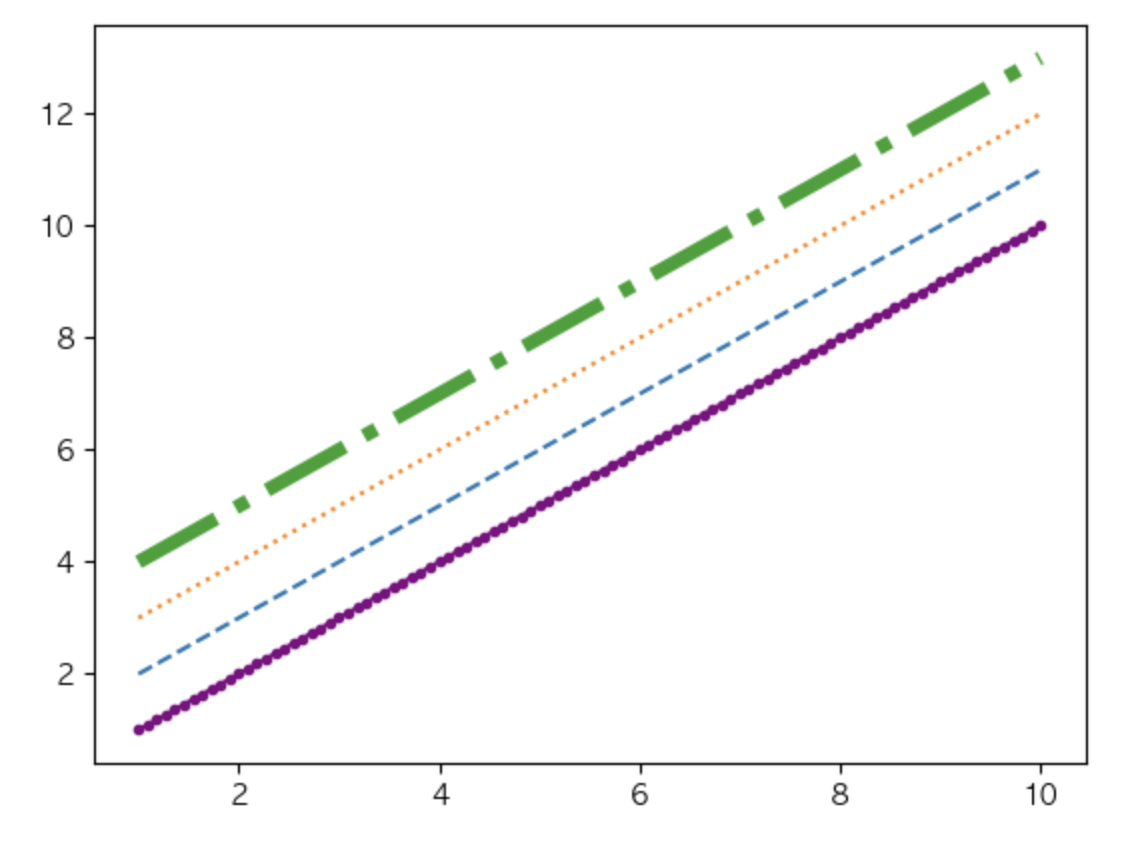
x = np.linspace(1, 10, num=100) # 1 ~ 10을 100등분(num) 한 분위값으로 이뤄진 1차원 배열을 생성.
x2 = pd.Series(x)
# plt 함수를 이용해서 선 그래프 그리기.
plt.plot(x, x, marker = ".", c = "purple")
plt.plot(x,x+1, linestyle = "--")
plt.plot(x,x+2, linestyle = ':')
plt.plot(x,x+3, linestyle = "-.", linewidth = 5) # linewidth 는 라인강고 가능.
plt.show()
1.3 선 그래프 활용
- 서울시 연도별 황사 경보발령 현황
- 연도별 관측일수와 황사최대농도의 변화를 그래프로 시각화
df = pd.read_csv('data/서울시 연도별 황사 경보발령 현황.csv')
df.shape
(12, 7)
df.info
<bound method DataFrame.info of       년도  주의보 발령횟수  주의보 발령일수  경보 발령횟수  경보 발령일수  관측일수  최대농도
0   2006         4         5        1        2    11  2941
1   2007         3         4        1        1    12  1355
2   2008         1         1        1        1    11   933
3   2009         2         3        2        3     9  1157
4   2010         4         5        2        3    15  1354
5   2011         4         7        0        0     9   662
6   2012         0         0        0        0     1   338
7   2013         0         0        0        0     3   226
8   2014         0         0        0        0    10   259
9   2015         1         2        1        2    15   902
10  2016         0         0        0        0     7   481
11  2017         0         0        0        0    10   423>
- ‘최대농도(㎍/㎥/시)’ => 최대농도
df.rename(columns = {'최대농도(㎍/㎥/시)':'최대농도'})
df.rename(columns = {df.columns[-1]:'최대농도'},inplace = True)
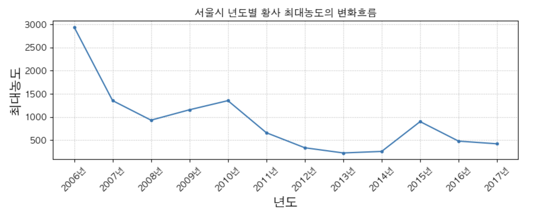
- 년도에 따른 황사 최대 농도의 변화흐름
plt.figure(figsize = (10, 3))
plt.plot(df['년도'], df['최대농도'], marker = ".")


plt.title('서울시 년도별 황사 최대농도의 변화흐름')
plt.xlabel('년도', fontsize = 15)
plt.ylabel('최대농도', fontsize = 15)

plt.xticks(df["년도"],
           labels=[str(y)+'년' for y in df['년도']], # tick 라벨의 size == ticks 의 size
           rotation = 45
          ) # 눈근의 위치. labels = ticks 라벨에 사용할 문자열 리스트


plt.grid(True, linestyle=":")
plt.show()
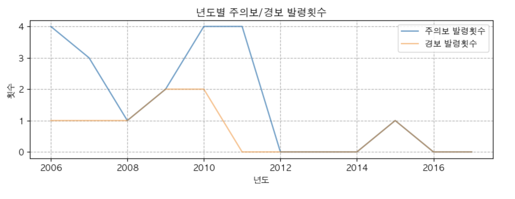
- 년도에 따른 주의보/경보 발령횟수의 변화 ==> 하나의 subplot 에 같이 그리기.
plt.figure(figsize = (10,3))
plt.plot(df['년도'], df['주의보 발령횟수'], alpha = 0.7, label = '주의보 발령횟수') # alpha 는 투명도 : 0(투명) ~ 1(불투명)
plt.plot(df['년도'], df['경보 발령횟수'], alpha = 0.5, label = '경보 발령횟수')

plt.title('년도별 주의보/경보 발령횟수')
plt.xlabel('년도')
plt.ylabel('횟수')

plt.legend()
plt.grid(True, linestyle = '--')
plt.show()
최대 농도와 관측일 수의 연도별 변화를 시각화
-
하나의 축을 공유하고 두개의 축을 가지는 그래프 그리기
- 값의 범위(Scale)이 다른 두 값과 관련된 그래프를 한 Axes(subplot)에 그리는 경우
- X축을 공유해 2개의 Y축을 가지는 그래프
- axes.twinx() 를 이용해 axes를 복사
- Y축을 공유해 2개의 X축을 가지는 그래프
- axes.twiny() 를 이용해 axes를 복사
- 년도별 관측일수와 최대농도의 변화르흠을 하나의 axes에 그리기.
plt.figure(figsize = (10,5))

plt.plot(df['년도'],df['관측일수'], label = '관측일수', marker = '.')
plt.plot(df['년도'],df['최대농도'], label = '최대농도', marker = ".")


plt.title('년도별 관측일수와 최대농도의 변화흐름')
plt.xlabel('년도')
plt.ylabel('최대농도 / 관측일수')

plt.legend()
plt.grid(True, linestyle = ':')
plt.show()
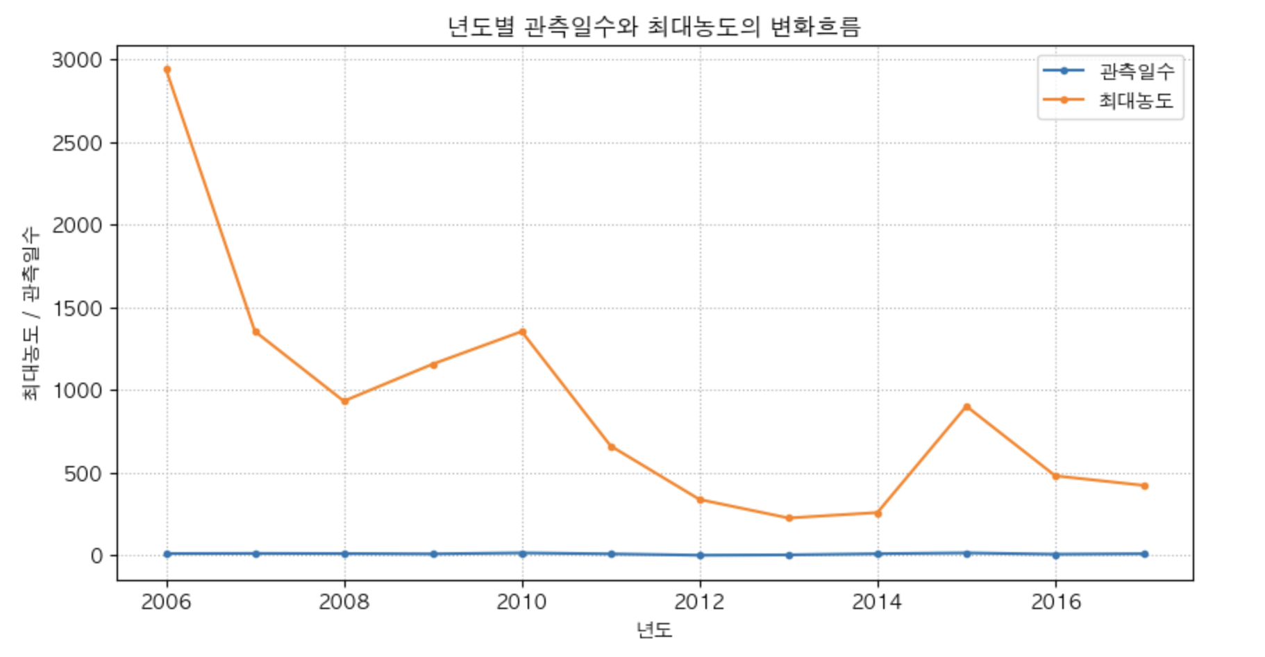
df[['관측일수','최대농도']].agg(['min','max'])
| 관측일수 | 최대농도 | |
|---|---|---|
| min | 1 | 226 |
| max | 15 | 2941 |
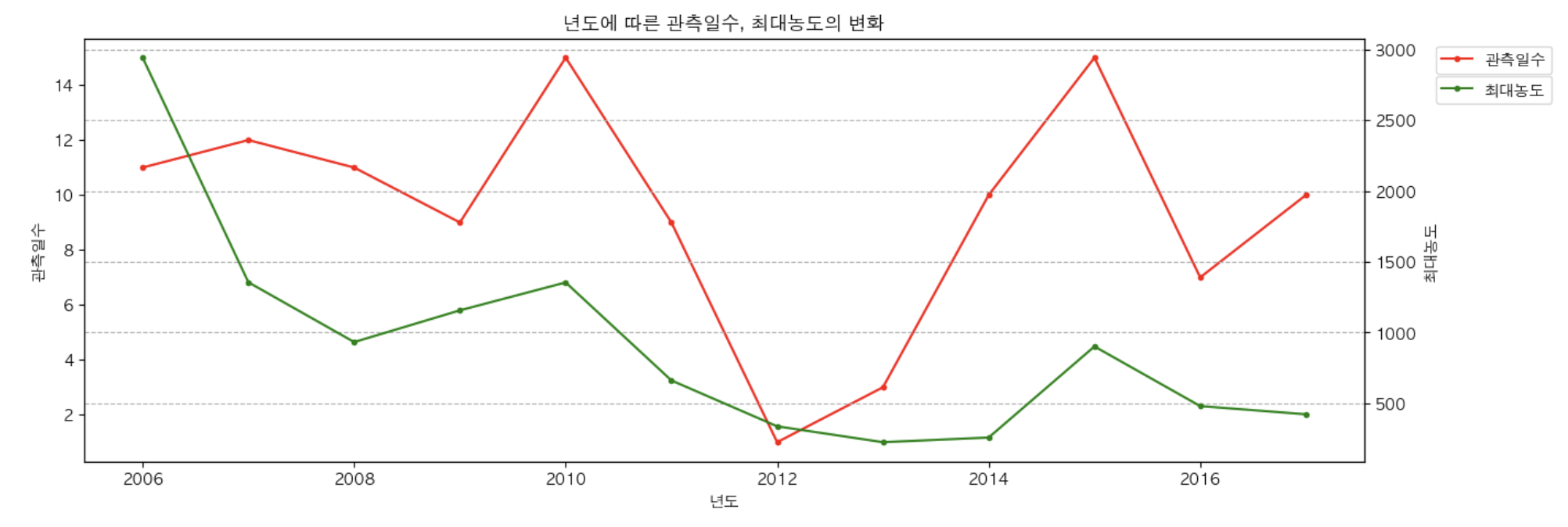
- twinx()를 이용해서 x축은 같이 사용하고 ysms 따로 사용하도록 처리.
plt.figure(figsize = (15,5))

ax1 = plt.gca() # 관측일수
ax2 = ax1.twinx() # ax1과 x축을 공유하는 새로운 subplot을 생성.

ax1.plot(df['년도'], df['관측일수'], label = '관측일수', color = 'red', marker = ".")
ax2.plot(df['년도'], df['최대농도'], label = '최대농도', c = 'g', marker = '.')

ax1.set_title('년도에 따른 관측일수, 최대농도의 변화')
ax1.set_xlabel('년도')
ax1.set_ylabel('관측일수')

ax2.set_ylabel("최대농도")

ax1.legend(loc = 'upper left', bbox_to_anchor = (1.05, 1))
ax2.legend(loc = 'upper left', bbox_to_anchor = (1.05, 0.93))
plt.grid(True, linestyle = "--")
plt.show()
legend 위치 지정
- 미리 지정된 위치로 잡기.
- legend(loc=”상하위치 좌우위치”)
- 상하: upper, center, lower, 좌우: left, center, right
- 정가운데 : ‘center’, ‘best’ : 최적의 위치를 알아서 잡아준다.(default)
- legend(loc=”상하위치 좌우위치”)
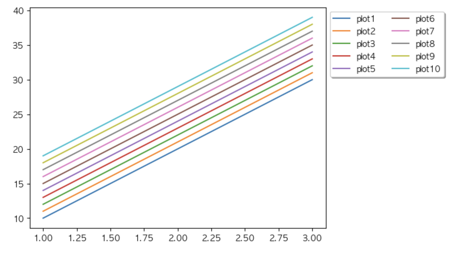
- 원하는 위치를 직접 설정.
- legend(bbox_to_anchor=(x,y), loc = ‘box의 상하, 좌우 위치’)
- bbox_to_anchor
- 전체 subplot의 x축과 y축의 비율
  하단: (0,0), (1,0)
  상단: (0,1), (1,1)
- 전체 subplot의 x축과 y축의 비율
- loc -> bbox_to_anchor 좌표지점에 범례 box의 어느 지점을 붙일 것인지 지정.
- ex) bbox_to_anchor = (1,1), loc = ‘upper left’ : subplot의 (1,1)지점의 범례박스의 위/왼쪽 점을 맞춘다.
- 0 ~ 1 사이는 박스 안쪽, 1 이상이면 박스 바깥쪽.
x = [1, 2 ,3]
y = np.array([10,20,30])

plt.plot(x, y, label = 'plot1')
plt.plot(x, y+1, label = 'plot2')
plt.plot(x, y+2, label = 'plot3')
plt.plot(x, y+3, label = 'plot4')
plt.plot(x, y+4, label = 'plot5')
plt.plot(x, y+5, label = 'plot6')
plt.plot(x, y+6, label = 'plot7')
plt.plot(x, y+7, label = 'plot8')
plt.plot(x, y+8, label = 'plot9')
plt.plot(x, y+9, label = 'plot10')

plt.legend(bbox_to_anchor = (1,1), loc = 'upper left',
          ncol = 2, shadow = True # ncol은 줄 나누기, shadow는 그림자 주기
          )
plt.show()
2. 산점도 (Scatter Plot) 그리기
2.1 산점도(산포도)
- X와 Y축을 가지는 좌표평면상 관측값들을 점을 찍어 표시하는 그래프
- 변수(Feature)간의 상관성이나 관측값들 간의 군집 분류를 확인할 수 있다.
scatter()메소드 사용- 1번인수 : x값, 2번인수 y값
- x와 y값들을 모두 매개변수로 전달해야 한다.
- x,y 의 인수는 스칼라 실수나 리스트 형태의 객체들을 넣는다.
- 리스트
- 튜플
- numpy 배열 (ndarray)
- 판다스 Series
- x와 y의 원소의 수는 같아야 한다.
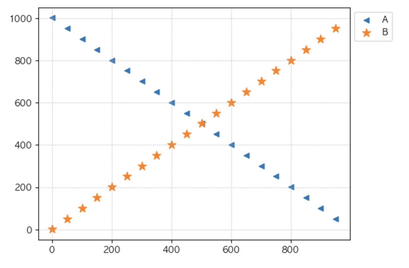
x = range(1, 1001, 50)
y = range(1001, 1, -50)
y2 = range(1, 1001, 50)

print(len(x), len(y))
20 20
plt.scatter(x, y, label = 'A', marker = '<') # 비례적인 관계
plt.scatter(x, y2, label = 'B', marker = '*', s = 100) # 반비례적인 관계

# plt.legend(['A라벨', 'B라벨']) 이런식으로 A와 B의 라벨 표시를 동시에 할 수 있다.
plt.legend(bbox_to_anchor = (1,1))
plt.grid(True, linestyle = ':')
plt.show()
2.2 설정
- marker (마커)
- marker란 점의 모양을 말하며 미리정의된 값으로 변경할 수있다.
- scatter() 메소드의 marker 매개변수를 이용해 변경한다.
- https://matplotlib.org/stable/api/markers_api.html
- s
- 정수: 마커의 크기
- alpha
- 하나의 마커에 대한 투명도
- 0 ~ 1 사이 실수를 지정 (default 1)
2.3 산점도 활용
df = pd.read_csv('data/diamonds.csv')
df.shape
(53940, 10)
df.info
<bound method DataFrame.info of        carat        cut color clarity  depth  table  price     x     y     z
0       0.23      Ideal     E     SI2   61.5   55.0    326  3.95  3.98  2.43
1       0.21    Premium     E     SI1   59.8   61.0    326  3.89  3.84  2.31
2       0.23       Good     E     VS1   56.9   65.0    327  4.05  4.07  2.31
3       0.29    Premium     I     VS2   62.4   58.0    334  4.20  4.23  2.63
4       0.31       Good     J     SI2   63.3   58.0    335  4.34  4.35  2.75
...      ...        ...   ...     ...    ...    ...    ...   ...   ...   ...
53935   0.72      Ideal     D     SI1   60.8   57.0   2757  5.75  5.76  3.50
53936   0.72       Good     D     SI1   63.1   55.0   2757  5.69  5.75  3.61
53937   0.70  Very Good     D     SI1   62.8   60.0   2757  5.66  5.68  3.56
53938   0.86    Premium     H     SI2   61.0   58.0   2757  6.15  6.12  3.74
53939   0.75      Ideal     D     SI2   62.2   55.0   2757  5.83  5.87  3.64

[53940 rows x 10 columns]>
plt.figure(figsize = (10,7))
plt.scatter(df["carat"], df['price'],
           alpha = 0.1
           ) # 보통 x: 원인, y: 결과를 넣는다.

plt.title("캐럿과 가격간의 상관관계")
plt.xlabel('캐럿')
plt.ylabel('가격')

# plt.grid(True, linestyle = ":")
plt.show()
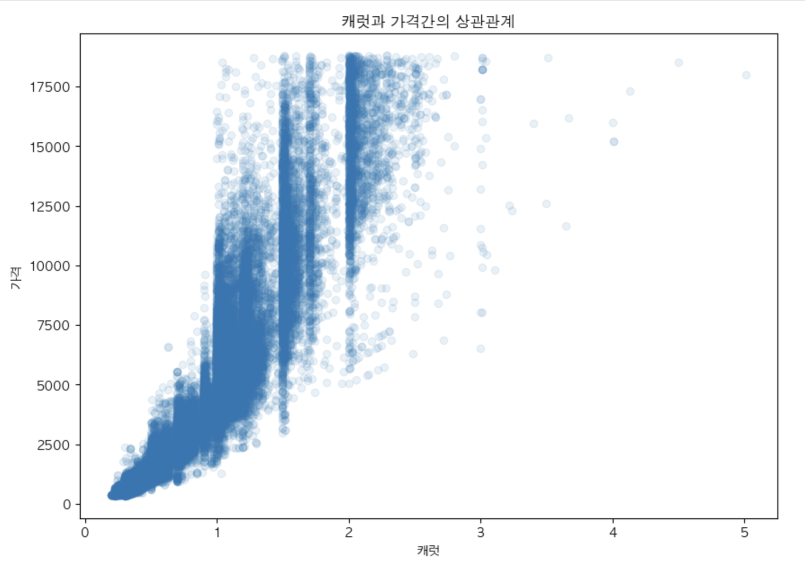
캐럿(carat)과 가격(Price)간의 상관관계 시각화
- 상관계수 계산
df[['carat', 'price']].corr()
| carat | price | |
|---|---|---|
| carat | 1.000000 | 0.921591 |
| price | 0.921591 | 1.000000 |
x 가 증가하면 y도 증가 - 비례적관계 (0 ~ 1)
x 가 증가하면 y는 감소 - 반비례적 관계 (-1 ~ 0)

# 회귀선
- 상관계수
- 두 변수간의 상관관계(비례/반비례)를 정량적(수치적)으로 계산한 값.
- 양수: 양의 상관관계(비례관계), 음수: 음의 상관관계(반비례관계)
- 양: 0 ~ 1, 음: -1 ~ 0
- 절대값 기준 1로 갈수록 강한상관관계, 0으로 갈수록 약한 상관관계
- 1 ~ 0.7: 아주 강한 상관관계
- 0.7 ~ 0.3 : 강한 상관관계
- 0.3 ~ 0.1 : 약한 상관관계
- 0.1 ~ 0 : 관계없다.
3. 막대그래프 (Bar plot) 그리기
3.1 막대그래프(Bar plot)
- 수량/값의 크기를 비교하기 위해 막대 형식으로 나타낸 그래프
- 범주형 데이터의 class별 개수를 확인할 때 사용
- bar(x, height) 메소드 사용
- x : x값, height: 막대 높이
- X는 분류값, height는 개수
- x : x값, height: 막대 높이
- barh(y, width) 메소드
- 수평막대 그래프
- 1번인수: y값, 2번인수: 막대 너비
- 매개변수
- 첫번째: 수량을 셀 대상
- 두번째: 수량
import matplotlib.pyplot as plt
import numpy as np
import pandas as pd

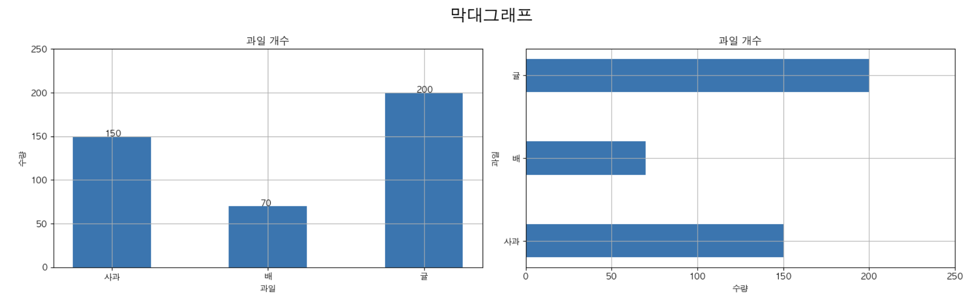
fruits = ['사과', '배', '귤']
counts = [150, 70, 200]

plt.figure(figsize = (16,5))

plt.subplot(1, 2, 1)
plt.bar(fruits, counts, width = 0.5) # width : 막대의 0 ~ 1


# plt.text(x좌표, y좌표, '출력할 텍스트')
for x,y in enumerate(counts):
    plt.text(x - 0.05, y, str(y))

plt.title('과일 개수')
plt.xlabel('과일')
plt.ylabel('수량')
# y축의 값의 범위를 변경
plt.ylim(0, 250)

plt.grid(True)

plt.subplot(1, 2, 2)
plt.barh(fruits, counts, height = 0.4)
plt.title('과일 개수') # subplot(axes)의 title 을 설정,
plt.xlabel('수량')
plt.ylabel('과일')

plt.xlim(0, 250) # X축의 값의 범위를 지정

plt.grid(True)

plt.suptitle('막대그래프', fontsize = 20) # figure 의 title 을 설정.
plt.tight_layout()
plt.show()
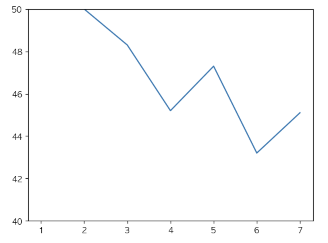
- xticks(), yticks() : 축의 눈금을 재정의 할때 사용.
- xlim(), ylim(): 축의 값의 범위를 재정의 할 때 사용.
x = [1, 2, 3, 4, 5, 6, 7]
y = [100.0, 50.0, 48.3, 45.2, 47.3, 43.2, 45.1]
plt.plot(x,y)
plt.ylim(40, 50) # 40 ~ 50 사이의 변화만 확인.

plt.show()
3.2 막대그래프 활용
df = pd.read_excel('data/강수량.xlsx')
df.shape
(4, 10)
df.set_index('계절', inplace = True)
df
| 2009 | 2010 | 2011 | 2012 | 2013 | 2014 | 2015 | 2016 | 2017 | |
|---|---|---|---|---|---|---|---|---|---|
| 계절 | |||||||||
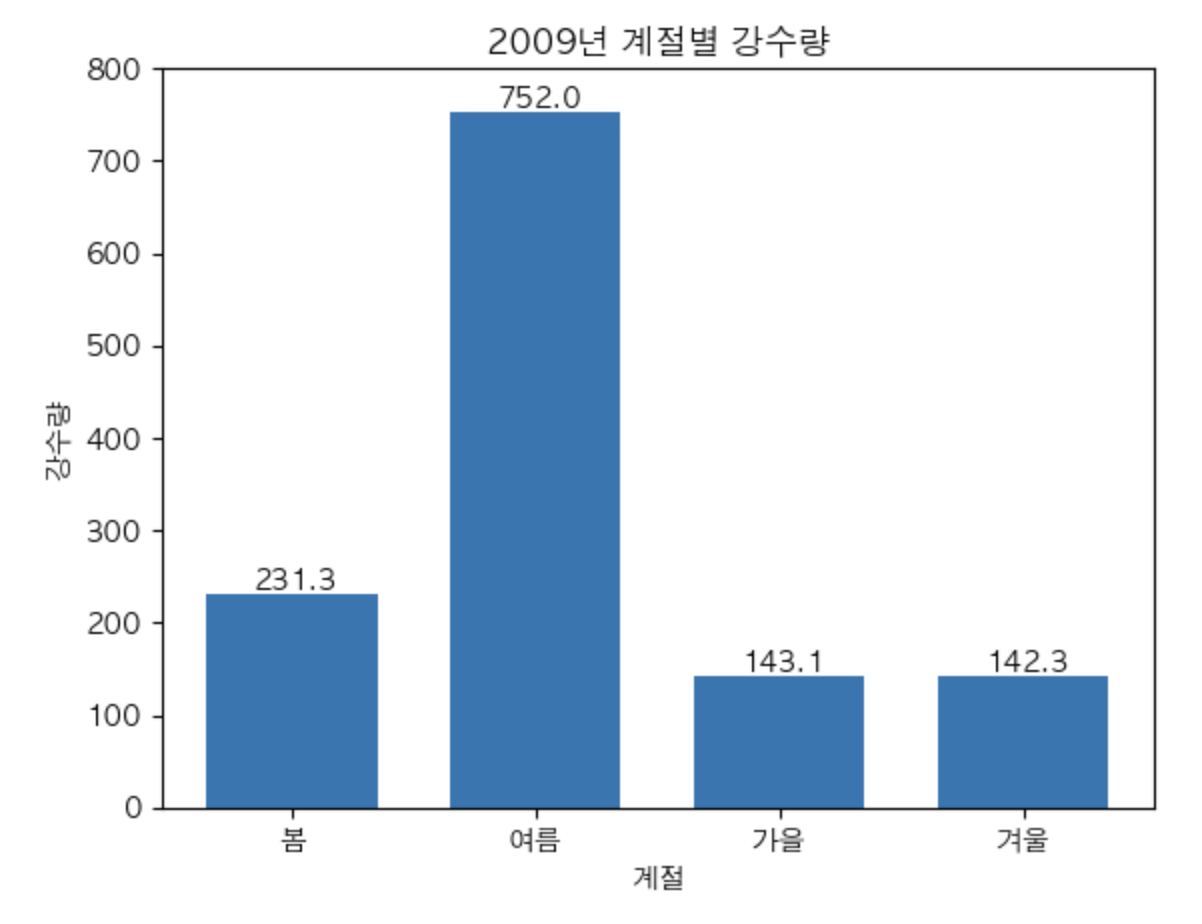
| 봄 | 231.3 | 302.9 | 256.9 | 256.5 | 264.3 | 215.9 | 223.2 | 312.8 | 118.6 |
| 여름 | 752.0 | 692.6 | 1053.6 | 770.6 | 567.5 | 599.8 | 387.1 | 446.2 | 609.7 |
| 가을 | 143.1 | 307.6 | 225.5 | 363.5 | 231.2 | 293.1 | 247.7 | 381.6 | 172.5 |
| 겨울 | 142.3 | 98.7 | 45.6 | 139.3 | 59.9 | 76.9 | 109.1 | 108.1 | 75.6 |
- 2009년 계절별 강수량을 막대그래프로 비교
plt.bar(df.index, df[2009], width = 0.7)
plt.title('2009년 계절별 강수량')

for x,y in enumerate(df[2009]):
    plt.text(x - 0.16 , y + 5, str(y))

plt.ylim(0,800)
plt.ylabel('강수량')
plt.xlabel('계절')

# plt.grid(True, linestyle =":")
plt.show()
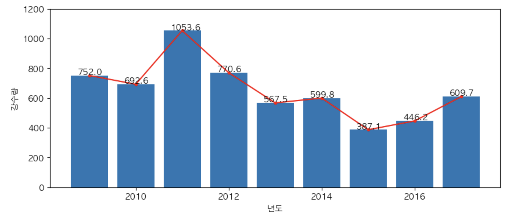
- 여름 년도별 강수량의 변화 => 주관심사 - 변화 흐름 –> line plot
plt.figure(figsize = (10,4))
plt.plot(df.columns, df.loc['여름'], marker = '.', c = 'r')
plt.bar(df.columns, df.loc['여름'])

for x,y in zip(df.columns, df.loc['여름']):
    plt.text(x - 0.25, y + 6, str(y))

plt.xlabel('년도')
plt.ylabel('강수량')
plt.ylim(0,1200)


# plt.grid(True, linestyle = ':')
plt.show()
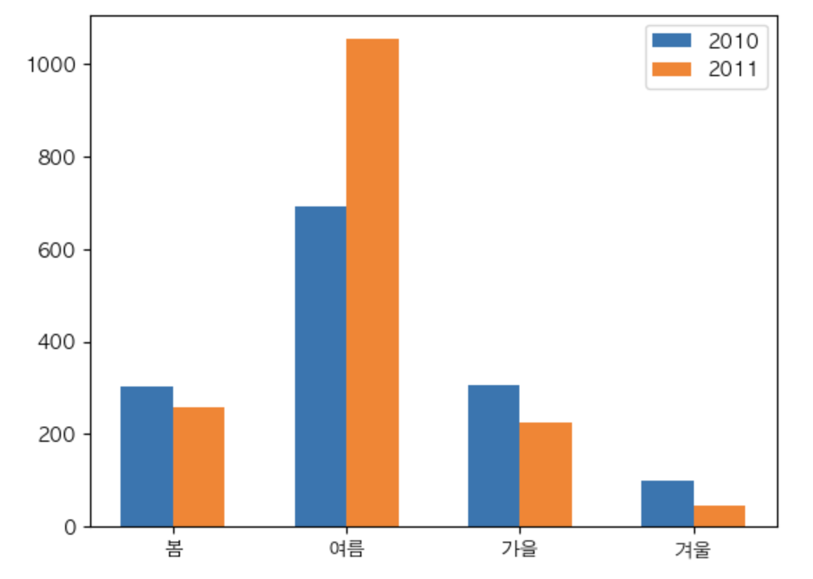
- 2010, 2011 년도 계절별 강수량을 확인 => 누적 막대 그래프
df.index # x
df[2010], df[2011] #y
len(df.index)
4
width = 0.3
x = np.arange(4)
plt.bar(x - width/2, df[2010], width = width, label = '2010')
plt.bar(x + width/2, df[2011], width = width, label = '2011')


plt.xticks(x, labels = df.index) # X: 눈금의 위치값. label: 눈금의 라벨
plt.legend()
plt.show()
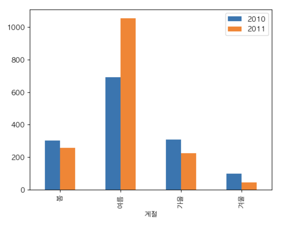
df[[2010,2011]].plot(kind='bar')
<AxesSubplot: xlabel='계절'>

댓글남기기